Mor Temor
Arch. Mor Temor is international Architecture firm committed to designing unique buildings and one of a kind architectural concepts.

But for some reason there is a temptation to make these public squares too large. Time and again in modern cities, architects and planners build plazas that are to large. They look good on drawings; but in real life they end up desolate and dead.
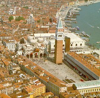
Our observations suggest strongly that open places intended as public squares should be very small. As a general rule, we have found that they work best when they have a diameter of about 18 m– at this diameter people often go to them, they become favorite places, and people feel comfortable there. When the diameter gets above 21 m, the squares begin to seem deserted and unpleasant. The only exceptions we know are places like the Piazza San Marco and Trafalgar Square, which are great town centers, teeming with people (see Fig. 3).

Fig. 3 Piazza San Marco in Venice (Italy).
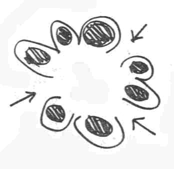
In many Public squares, the edge is critical. The life of a public square forms naturally around its edge. If the edge fails, then the space never becomes lively. In more detail: people gravitate naturally toward the edge of public spaces. They do not linger out in the open. If the edge does not provide them with places where it is natural to linger, the space becomes a place to walk through, not a place to stop. It is therefore clear that a public square should be surrounded by pockets of activity: shops, stands, benches, displays, rails, courts, gardens, news racks. In effect, the edge must be scalloped.
Further, the process of lingering is a gradual one; it happens; people do not make up their minds to stay; they stay or go, according to a process of gradual involvement. This means that the various pockets of activity around the edge should all be next to paths and entrances so that people pass right by them as they pass through. The goal-oriented activity of coming and going then has a chance to turn gradually into something more relaxed. And once many small groups form around the edge, it is likely that they will begin to overlap and spill in toward the center of the square. We therefore specify that pockets of activity must alternate with access points (see Fig. 4).

Fig.4 A conceptual diagram
To make the space lively, the scalloped edge must surround the space completely. When we say that the edge must be scalloped with activity, we mean this conceptually – not literally. In fact, to build this pattern, you must build the activity pockets forward into the square: first rough out the major paths that cross the space and the spaces left over between these paths; then build the activity pockets into these "in-between" spaces, bringing them forward, into the square.
If the space is a tiny one, there is no need for anything beyond an edge. But if there is a reasonable area in the middle, intended for public use, it will be wasted unless there are trees, monuments, seats, fountains – a place where people can protect their backs, as easily as they can around the edge. This reason for setting something roughly in the middle of a square is obvious and practical. But perhaps there is an even more primitive instinct at work.
Imagine a bare table in your house. Think of the power of the instinct which tells you to put a candle or a bowl of flowers in the middle. And think of the power of the effect once you have done it. Obviously, it is an act of great significance; yet clearly it has nothing to do with activities at the edge or in the center.
Apparently the effect is purely geometrical. Perhaps it is the sheer fact that the space of the table is given a center, and the point at the center then organizes the space around it, and makes it clear, and puts it roughly at rest. The same thing happens in a courtyard or a public square. It is perhaps related to the mandala instinct, which finds in any centrally symmetric figure a powerful receptacle for dreams and images and for conjugations of the self.
We believe that this instinct is at work in every courtyard and every square. Even in the Piazza San Marco, one of the few squares without an obvious center piece, the campanile juts out and creates an off beat center to the two plazas together (see fig. 3) (Christopher, 1977).
For architects, urban design is epitomized by the creation of urban spaces like the central piazzas of Italian cities. The Italian piazza (square) is as hypnotic an image for urban designers as the neighborhood unit plan. The square can certainly give an identity to an area by acting as landmarks and symbols, and they can provide opportunities for people who are friends (or stranger) to gather an share the experience of benign a place (Jon, 2004), and for families to spend leisure time in a beautiful place, lively piazza.
Arch. Mor Temor